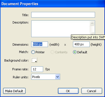
First of all, you need to make sure that ruler Units is set to pixels. This is the standard unit of measurement in multimedia and web pages. It’s important to set Ruler Units to Pixels because this affects several other dialog boxes (including the Info panel). Next to Background Color, you should see a white swatch that, when clicked, allows you to change the stage color. This isn’t actually as useful as you might think because at the time you publish a movie to the web, you can specify any background color you want, and it will override this setting. Feel free to change Background color any time you want. Maybe gray will be easier on your eyes, or black will make selecting white graphics easier. I often use a bright red background just so it’s super clear while I’m editing. Do whatever you want-not only can you change this setting later, but it also affects only the stage color while you’re editing.
Two other Document properties dialog box settings are important to establish early in any project: Frame Rate and Dimensions. Frame Rate specifies the rate-that is, how many frames per second-at which Flash attempts to play. Is say attempts because some of your users might not have a computer fast enough to keep up, so Flash just can’t display the specified number of frames in a second. Flash will not exceed the frame rate you specify, but it can get bogged down and not keep up. Dimensions are important only to the degree that they affect the aspect ratio of your stage, as discussed earlier. You need to decide up front on the shape for your stage (sorry, it can’t be round). Do you want a wide-screen cinemascope look, or do you want a square stage? You might even want a vertical rectangle, such as for a button bar to appear on the left side of a web page. You need to consider this early on because the stage shape influences how you position graphics, and changing it later makes for a lot of repositioning.
People often confuse frame rate with speed, which is more of a visual effect. Animators can use tricks to make something appear to speed across the screen even while using a very low frame rate. For example, if you see a picture of a car on the left side of the screen and then a fraction of a second later, it’s on the right side of the screen that may tell your brain that the car is moving fast. However, such a trick requires only two frames-and at a frame rate of 4 fps, the second frame appears only a quarter second after the first! Frame rate-that is, how many chunks into which each second is broken-controls the visual resolution. Four frames a second may look “chunky”-each change occurs only four times a second. However, 30 fps (equivalent to the frame rate of TV) is such a fine increment that you’re not likely to see the steps between discrete frames (although, of course, that’s what’s really happening). By the way, you can still move a car across the screen in a quarter of a second by using 60 fps-it would just involve 15 frames. You’ll explore this topic in great detail in Next Postings.

No comments:
Post a Comment