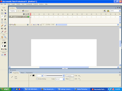
1. Start a new file (by pressing Ctrl + N and selecting either of the first two options for Flash File). Lines can have different stroke attributes, so make sure the Properties panel is visible and in a convenient place first. If your Properties panel isn’t present, select Window, properties, Properties (yes, it’s listed in a submenu). The default position for the Properties panel is fine
2. Select the Line tool, which draws straight lines. When your cursor is on the Stage. It changes to a crosshairs. Click and drag to create a line. You might notice a dark ring that sometimes appears while you drag. This is flash way of assisting you while drawing. In the case of the line, you’ll find drawing perfectly horizontal and vertical lines to be quite easy when the Snap to Objects option is selected from the View Snapping menu. (holding Shift also constrains the angle to diagonal as well.)
3. Changing any setting in the Properties panel will affect subsequent lines you draw. Select a different stroke color in the square swatch on the Properties panel. Then change the stroke height, either by typing a number in the Stroke height fieldor by clicking the arrow and dragging the slider. Set the stroke to 15. Then draw a horizontal line. For this exercise, we need a total of three copies of this line. Use the Selection tool to select the first line, select Edit, Copy and then choose Edit, Paste in Place and then press the down arrow on your keyboard. Repeat this so you have three identical lines.

4. You can change any attribute of lines you’ve drawn through the Properties panel if you simply use the Selections tool to select the line. Select the first line and, from the Cap option menu in the Properties panel, select None. Select the second line and choose Round (the default Cap). Finally, set the last line and choose Square. The different Cap options are represented in an icon that appears on the Properties panel. I think the easiest way to really see the differences is to use the sub selection tool and click each line while holding Shift. The skeleton of the line is shown with the two square handles at the endpoints. (remember to get the Selection tool back, by pressing V, in order to simply select the lines.) square Cap may appear identical to None, but Square is similar to Round in that it extends both ends of the line by half the stroke thickness. Think of how you could draw the Round cap with a compass that’s pinned to the endpoint.

5. Lines have a few other interesting properties that I’ll go over at the end of this task. For now, you’ll see some of the options available when drawing lines. Select the Pencil tool. Notice that the Pencil tool has the option Pencil mode. Click and hold the button that appears in the Options section to change the Pencil Mode setting
6. The Straighten option attempts to straighten what you draw. Try drawing the letter s, it’s likely to look jagged. Now try drawing the letter Z. but drawing these letters should exemplify how the Straighten Pencil Mode setting works.
7. Choose the Smooth option and try drawing an s and a Z. what happens to the S is nice, but the Z has curves where there weren’t any before. The Smooth option can come in handy if you find that your hand-drawn images look too jagged. Also notice that you can change the degree of smoothing in the Properties panel. This setting for Smoothing (from 0 to 100) is only visible when you have the Pencil Tool (or Paint Brush as You’ll see later) and you have the Smooth option selected.
8. The Ink Pencil Mode setting draws almost exactly what you draw. Flash adjusts what you draw to reduce the file size. The simple line flash creates takes less data to describe and results in a smaller file that’s faster to download.
9. Finally, notice the Option for Object Drawing in the Tools Panel when the Pencil Tool is selected. The choice between Object Drawing or not (the opposite being called Merge Mode Drawing) is actually quite profound. For now be sure it’s deselected (so you’re in Merge mode)
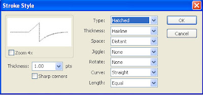
The Properties panel affects lines drawn with the Pencil tool in the same way it affects those drawn with the line tool. One of the attributes that you haven’t yet experimented with is the stroke style. The drop-down list shows you a visual representation of each style. Solid (the default) is like Hairline, but Hairline effectively sets the stroke height to the lowest number possible. You should use the other fancy stroke styles with extreme caution. This is simply because the more random-looking ones tend to add to the file size. “Minimizing File Size,” but realize for now that you’ll suffer a significant file size increase if you use some stroke styles.
If those stroke styles aren’t enough, (when a line tool is selected) the Custom button on the Properties panel provides a way for you to create your own custom stroke styles. The dialog box that appears after you click the Custom button lets you control several attributes of your own custom line styles. These custom line styles are fun, but be warned: they can significantly add to file size. Really, it’s significant!

The Stroke hinting feature has a very subtle effect. Namely, lines you draw will always be anchored on round pixel numbers. Flash is a sub-pixel drawing tool meaning it’s possible to make a line start, end, or pivot on any coordinate-such as 103.4 pixels from the left. This is the case when Stroke hinting is not selected. At 100% zoom. Such a point is rounded of to 103 but when you zoom in, one normal pixel might take up several actual pixels on the monitor. No stroke hinting is great for accuracy, but can make thin lines appear slightly blurry-because Flash is effectively rounding some points up and rounding other points down. Select Stroke hinting to ensure sharp looking lines. Just realize if you zoom way in the lines might not appear exactly where you position them.
Finally, the Scale option is the hardest feature to notice unless you know how to we it. Basically, Scale describes what sort of resizing should cause the stroke to thicken. Say you draw a rectangle that is made of both a stroke outline and a fill interior (which you’ll do later in “Drawing and Modifying Shapes by Using Lines and Fills”). If you enlarge (that is, “scale”)the rectangle you may or may not want the stroke to also get thicker. The scale option for normal will cause the line to thicken in proportion to the scale where None will keep the line appearing the same thickness. Vertical and Horizontal mean the thickness grows in proportion to the specified scale. For example, a line with Horizontal scale thickness only when you widen it; whereas making it taller has no impact on thickness. The worst part is that you won’t see this effect until you put the lines inside a symbol that gets scaled.

No comments:
Post a Comment