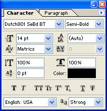
Font
Use the Font pop-up to choose from the list of fonts available on your system. Choose a style – such as Bold or Italic – from the Font Style pop-up.
Size
Enter a value in the Size box to change the size of your type. Points are the default unit of measurement for type in Photoshop.

Leading
Leading controls the distance from one baseline of type to the next. Enter a leading value in points in the Leading entry box. Photoshop applies a default leading value of 125% of the type size you have selected if you leave the leading set to (Auto).
Kerning and tracking
In the Character palette, you can create settings for kerning and tracking. Metrics, the default, uses the built-in pair kerning table for the font.

1. To kern character pairs, click between the characters in the text entry window to place the text insertion bar. You can enter a value in the Kerning entry box or use the pop-up to choose a preset value. Negative values move characters closer together. Positive values move characters apart. Press Enter/Return to accept the changes made in the dialogue.

2. For Tracking, highlight a range of text you want to track. Enter a value in the Tracking entry box, or use the pop-up
Baseline Shift
The Baseline Shift control allows you to move highlighted characters above or below their original baseline to create a variety of effects.
1. To baseline-shift characters, in Text Editing mode make sure you highlight the characters you want to shift.

2. Enter a positive value to baseline-shift upwards, enter a negative value to baseline-shift downward.

Anti-aliasing
The anti-aliased setting in the Options Bar creates type with a slightly soft edge. It does this by blurring the pixels that from the edge of the type. Use this option to avoid unnecessary jagged edges, unless you are working with very small type. Anti-aliasing text can help the type to blend into its background. Text that is not anti-alised can look jagged. Choose an amount of anti-aliasing from the Anti-aliasing from the Anti-alias pop-up in the Options Bar.
Type at very small sizes can appear blurred if anti-aliasing is applied.
Hot Tip:
• You can choose Window>Show Character to show the Character/Paragraph palette or you can click the Palettes button in the Options Bar if you have the Type tool selected.
• If you are uncertain about which control is which in the Character palette, rest your curser on the icon to the left of the entry box until the ToolTip label appears:

• A Faux (or false) style allows you to simulate a font style which doesn’t exist on your system, you cannot apply Foux Bold to warped type.
• To change the color of selected text. Click the Color box in the Options Bar or in the Character palette.

• In most instances, fractional character widths provide the best spacing for type. Switch off the Factional Widths option when working with type below 20 points that is to be viewed on screen. If you leave the option selected, type characters may run together when displayed on a monitor screen.
Access the factional Widths option from the pop-up menu in the Character palette.

No comments:
Post a Comment